Probably the most common sin I see with photography on Facebook or Instagram is oversaturated colors.
People just don’t seem to know when to stop pushing the saturation slider.
The result is often unnatural colors and colors that bleed over and become blurry.
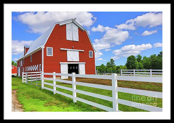
This photograph of a bright red barn, blue sky, white fence, and green grass probably approaches the unnatural level. I took it on a nice bright sunny day around noon as a three-exposure high dynamic range composite – three shots, each at a different setting and then combined into one shot.

It really was that eye-popping of a scene as Pineland’s farm is kept well painted and the grass was very green after a week of rain.
The problem with most highly saturated photographs is the photographer attempts to increase saturation on colors that didn’t exist when the photograph was taken – say on a cloudy day. The result is noisy, blocky, grainy images with weird colors.


I tend to stick to more realistic colors or even desaturated colors. In Adobe Lightroom, I normally will push the vibrance slider to bring out certain less saturated colors but leave the saturation slider alone.
Often I’ll use color to create a mood or atmosphere that is entirely different than the reality of what I experienced at the time, especially when creating images for the book cover market.


