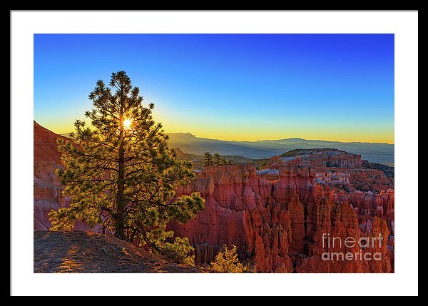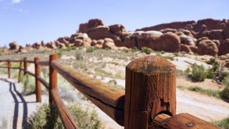
Above: So when we travel to Utah we should pay attention to the incredible fence posts and ignore the amazingly colorful rock formations?
One of the light bulb moments in one’s growth as an artist or photographer is that point at which you can determine which images are good and which images should simple go in the trash.
For some people is moment takes years, for others it never happens. It’s a lot of time studying good photography and learning the elements of composition to train your eye to see good compositions while taking photograph and to be able to edit out bad photos later when you are going through them.
Some photographs can be saved through post-processing. Color, contrast and light can be enhanced. Distracting elements can be removed etc. But you can’t really improve a poor composition or fix any focusing issues. Something that is blurry just need to be trashed.
I take a bunch of crappy photographs on every photo shoot but you will never see them. They either get trashed immediately or simply just stay on my hard drive, never to be processed.
In contrast we all know that Uncle or friend who bores us to death showing us all 678 photos they took on their cruise on a DVD set to cheesy music or worse yet, every single car photo they took at the car show with their phone.
Professionals only show their best work, which is why when I run across a travel blogger with terrible photographs I wonder, what are they thinking?
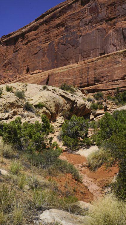
Like this photo from a travel blog article about the National Parks in Utah. How is this washed out, blurry photograph of a random cliff suppose to sell us on the idea that we should spend time and money traveling to Utah?
The whole point of talking up travel locations is to sell the place as a worthy travel location. Show us what makes the place unique. Don’t show us dull, boring, mid-day washed out photos taken by someone who slept in during the best light.
Take this quote for example:
“It always amazes me how colorful the desert is when you look closely. This is actually one of my favorite shots from Arches National Park. I love the textures, colors and wide open space in this photo.”
Unnamed Travel Blogger
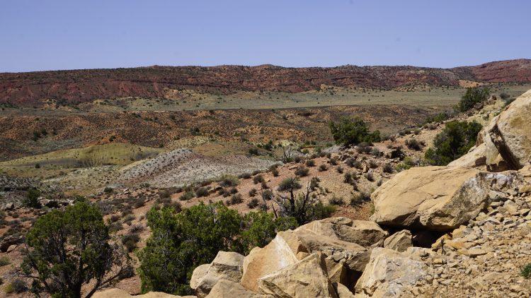
And here is the photo which is neither colorful or close-up. Are we supposed to zoom in somehow and look at some hidden colors or textures? Or are we supposed to get a sense of the “wide open space”? How can we tell how wide open it is with no point of reference, no person, no vehicle to provide a sense of scale?
If you use the word “amazing” the photograph better be amazing. If you use the word “close-up” the photo should be showing a close-up. If you mention “texture” – show us some texture. And certainly, if the point is to show color make sure the images isn’t flat, dull and lacking of contrast.
So much better to show one or two truly amazing shots then a bunch of boring, dull, washed out and fuzzy photographs then really should be trashed. Think about it, does Stephen King publish his rough drafts? Do painters show their rough sketches? Create and show your best work.