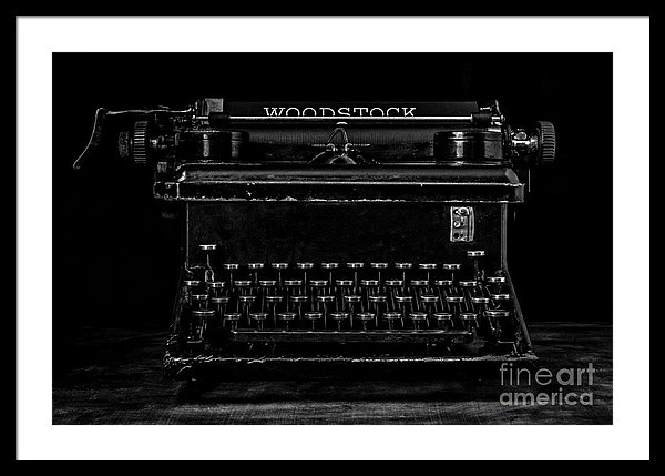
Photographers have long known that black and white photography is more about the content of the image as opposed to color photography which tends to be more about, the color. Color photography is style, mood and well, the color where as black and white photography strips the subject down to its essence and allows one to explore the images content.
This is why street photographers prefer the black and white format. They want the view to focus on the content of the image and not be distracted by color.
Black and white photography has also been considered the more “serious” format as color photography is associated with commercials and family portraits taken at the mall.
“In the ’70s, in Britain, if you were going to do serious photography, you were obliged to work in black-and-white. Color was the palette of commercial photography and snapshot photography.” – Martin Parr
So photographers knew the power of black and white photography was in its ability to focus the viewer on the intended content of the image and to take the image more serious. Now a new study on the use of black and white photographs to sell products concurs with this sentiment.
“Black-and-white images can lead consumers to focus on the abstract, essential, and defining components of a product. In contrast, color images can draw attention to the concrete, sometimes unimportant and idiosyncratic features of the product,” write authors Hyojin Lee, Xiaoyan Deng, H. Rao Unnava, and Kentaro Fujita (all The Ohio State University).
Consumers should be aware that colorful, flashy advertising can distract us from thinking about basic product features (a car with high fuel efficiency) and lead us to pay more for products with frivolous or unnecessary features (a car with nice cup holders).
“Color has become dominant in marketing because it attracts attention and promotes favorable attitudes. However, there may be times when companies might prefer to use black-and-white advertising. If a product’s primary features are superior, companies can successfully promote the product by using black-and-white images. On the other hand, if a product’s secondary features are superior, companies should consider using color images to draw attention to these otherwise easily overlooked features,” the authors conclude.
Hyojin Lee, Xiaoyan Deng, H. Rao Unnava, and Kentaro Fujita. “Monochrome Forests and Colorful Trees: The Effect of Black-and-White versus Color Imagery on Construal Level.” Journal of Consumer Research: December 2014.